Colour
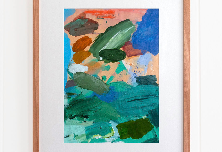
Bright, bright, bright… Madeleine loves to use bold colours in her artwork which liven up the atmosphere of a space. You can use all the colour theory you like when it comes to selecting the right design and art for you, but it all comes down to what you like… No, it comes down to what you love! Buy art you feel connected to! Buy art that sparks an emotion in you. If you love it, don’t leave it behind.
Colour theory can be quite complex, so we recommend you buy the art you love and get your interior designer to work it into your beautiful space. If you don’t have an interior designer, then here a couple of simple colour ideas which could help you create a balanced space.
You can:
a) Select a colour from the artwork you love and use variations in tint, shade and/or tone of that colour when decorating your space. (Note: tint refers the amount of white added to a colour, shade is the amount of black added, and tone is adding both).
b) Select an artwork you love which utilises a colour or colours present or complementary to those in your space or décor.
Whichever approach you decide to take, here is a brief summary of some helpful terms and theories on getting colours to work together:
Select a key colour from the artwork which fits into the same monochromatic colour scheme you have in your space. Monochromatic colours are colours based upon the same hue on the colour spectrum. For example, all the varying colours of red including its tints, shades and tones. You could select a painting which has one or more of your key monochromatic colours present.
Complementary colours are hues which lie opposite each other on the colour wheel. When they are placed next to each other they generate visual energy. Traditional complementary colours include red and green, yellow and purple, and blue and orange. Madeleine loves to use complementary colours in her original works. You could select a painting based on a colour which is complementary to the key colours in your space.
Analogous colours are hues which lie next to each other on the colour wheel. When you mix the two colours together, you create a new colour, yellow and green are next to each other and when you mix them you get yellow–green, a new colour. Thus, the three colours are analogous because of their close relationship to one another. Interior designers often use analogous colours to decorate as it gives a sense of harmony.
The 60-30-10 rule is an old interior design rule of thumb which suggests using three key colours in your space, with the main colour accounting for 60% of the colour used in your room, the secondary colour 30% and the third colour 10%. The main colour is usually the wall or floor colour and often a more neutral or subdued colour. The secondary colour should then contrast with the main colour and the third colour is intended as an accent colour – usually the boldest of the three colours. You could choose to match a colour from your piece of art with the accent colour to provide connection for example.
Lighting
You may also want to consider the amount of light in the space you plan to hang your new artwork. This is important because it will impact how you see the piece, particularly from different angles. It may also lead you to consider whether you want brighter or darker colours in your artwork.
Most of Madeleine’s originals are varnished with a matte varnish which allows them to be hung in both low and high light spaces as it reduces glare and reflectivity of light.
If you have a print with glass or perspex to protect it, this will have an impact on reflection at certain angles, depending on the sources of light in the space, so you may wish to take this into account.


